Growing up modern with Susan Saarinen

Author

Susan Saarinen

Tags

Newsletter, docomomo, Growing up modern, special edition
Image details

“Modern” means of our time, as opposed to an earlier time, but I was growing up in the middle of the 20th century, so “modern” had some extra meanings. Architects spoke of the Bauhaus, the International Style, lack of ornamentation, clean simplicity, rational and functional forms, and integration with nature. I heard these words and phrases around the dinner table along with the names of many architects, such as Gropius, “Mies” and “Corbu. I heard them, but, as a child, they meant nothing to me. I simply ate my dinner and went off to play.


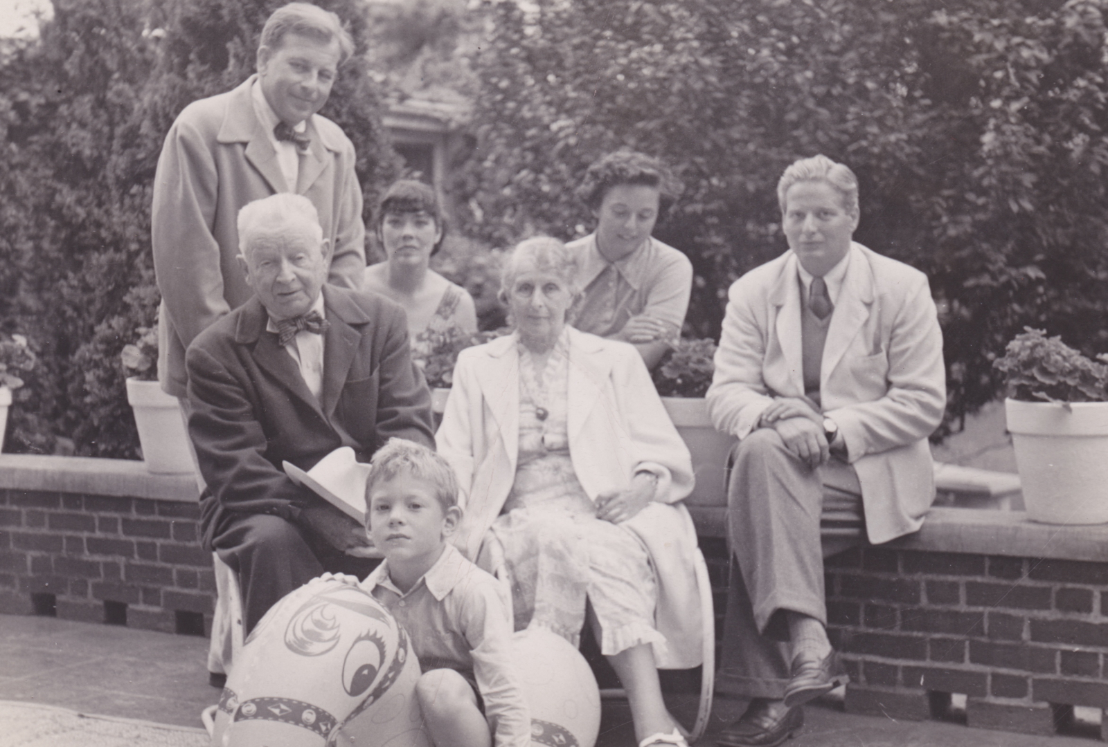
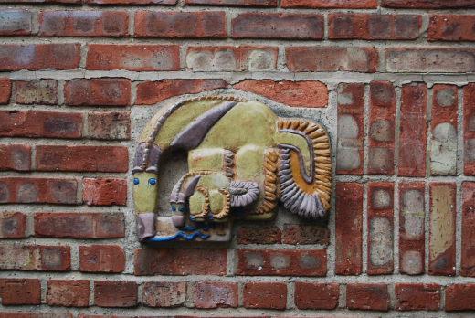
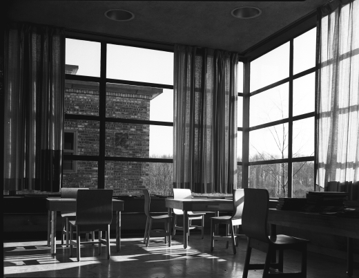
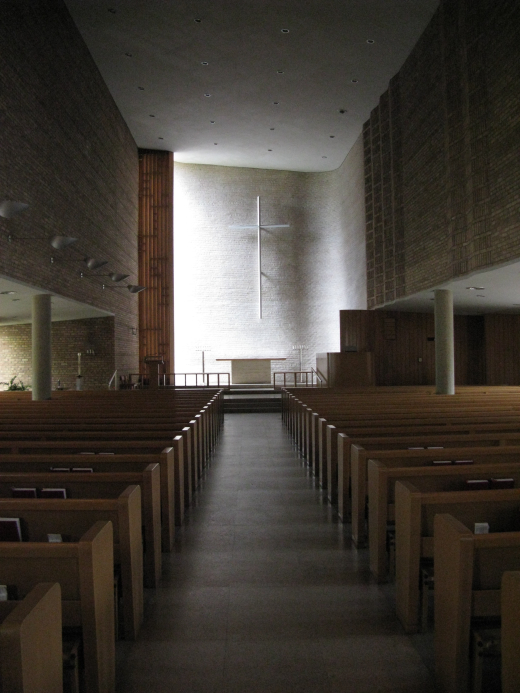
By the time I was born, my grandfather, Eliel Saarinen, working with my father, Eero Saarinen and my uncle, J. Robert F. Swanson, had won the much acclaimed first prize for the Smithsonian American Art Museum competition in Washington, DC, never built due to lack of funds. Concurrently, Eliel designed the Crow Island School in Winnetka, Illinois, the first modern elementary school in the United States, with Eero and Charles Eames designing the furniture and Eero’s fiancée, Lily, designing and creating sculptures for the children. Shortly after that Eliel, his wife Loja, Eero and Charles worked on the designs for the First Christian Church in Columbus, Indiana, Eero and Charles again designing the furniture. When I was two years old, my father and mother worked together with Jay Barr, Alexander Girard and Dan Kiley on the Jefferson Westward Expansion Memorial Competition submission that would later become the Gateway Arch in St Louis, MO., a memorial that was a technically and artistically daring modern symbol of the past, for the future.

As a small child, I was familiar with my house and my grandparents’ house. My house was the oldest house in Bloomfield Hills, a gingerbread brick Victorian house with traditional windows, a huge brick fireplace in the middle of a small living room, an icebox in the kitchen and a dark green porch in front shaded by huge old spruce and walnut trees. We had a hodgepodge of furniture and art objects, some rustic, some modern and some intriguing to young children, but nothing that could be called traditional American. My father’s womb chair presided over the living room and there was a simple, sleek-lined couch, but nothing like my friend Diana’s overstuffed, flowery, comfy chairs. Ironically, our house was a stark contrast to the modern, boxy buildings at Cranbrook.


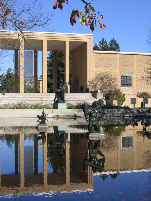
Cranbrook was George Gough Booth’s dream to create an art academy similar to the Royal Academy of Art in Rome in the Arts and Crafts style. George and his wife, Ellen Scripps Booth bought a rundown farm on 174 acres (now comprising 319 acres) outside of Detroit, Michigan and began to create what has become one of the world’s leading centers of education, art and science.


The Booth’s home and Christ Church1 were designed before my grandfather came to the United States. Henry Booth, the Booth’s son, an architect who studied under Eliel at the University of Michigan in Ann Arbor, introduced his father to Eliel, a man with experience in planning cities around the world as well as structures of many sorts. The elder Booth was impressed and engaged my grandfather to design the campus and the rest of the buildings at Cranbrook. These included three schools, student and faculty housing, the art academy studios for both students and artists-in-residence, an art museum, a library, a science museum and worker’s housing in addition to sports and performance arenas, a series of naturalistic pools and landscaped gardens and courtyards throughout.

My grandparents’ house, compared to mine, was open and light, with lots of large windows made with beautiful leaded glass designs. The furniture, made with handsome fabrics and inlaid woods, was designed specifically for their home, each piece carefully planned and handcrafted in the modern style. The carpets fit the spaces they were in and matched the colors around them. Each piece was pleasing and rich, but the spaces they occupied were uncluttered and open, inviting someone to occupy and animate them.


My grandfather’s extensive architectural and planning practice in Finland had afforded him, in previous decades, an opportunity to meet talented men and women throughout Europe. When my grandfather became president of the art academy in 1932, with Booth’s blessing he invited talented arts and crafts masters in diverse disciplines to live and work at the academy. Among them were Carl Milles (advanced sculpture), Maija Grotell (ceramics), Zoltan Sepeshy (painting and drawing) and Arthur N. Kirk (metalwork and jewelry). The idea was to expose graduate students who were working on their own projects to the ideas and experience of the masters. No classes. No need to work a previous medium. Explore. Create. Invent. State a problem to solve and solve it. This approach attracted some remarkable students. Among them were names well known to midcentury modern design. Charles Eames, previously trained as an architect, designed furniture. Lily Swann, trained as a sculptor, learned how to work with clay in order to create her very unique animal sculptures. Harry Bertoia, with drawing and painting experience explored printing and metal work. Jack Lenor Larsen, who studied architecture and furniture design, studied weaving at Cranbrook and became the fabric designer for modern architecture. Florence Schust (Knoll), a versatile early talent, became a furniture designer and co-founder of Knoll International.

Growing up, I didn’t think I liked modernist architecture. I disliked Le Corbusier’s La Tourette, and Mies van der Rohe’s glass boxes. I didn’t like lifeless gray concrete and I didn’t know what the point of the modernist movement was until graduate school. It was only then that I discovered the thinking behind it! Wait! What? All those years that I thought Bertoia’s chairs and sculptures were cool, Charles Eames’ house in Malibu was crazy and fun, my grandfather’s buildings were beautiful, rich and spacious and my grandmother’s carpets and curtains were stunning, yet I didn’t like Modern? Clearly, I had strong preferences, but they weren’t defined in my mind as yet.


When my parents were divorced, a radical change occurred at my old house. It was modernized. Big windows, efficient storage, space, bigger spaces, fewer objects and pieces of furniture, less color (which I missed) but more space to breathe. Was this modernist architecture? Room to breathe? I liked it.

In college, I studied ceramics and weaving, illustration and graphics. I knew I didn’t want to be an architect. Too Hard! I was lost. Then one day landscape architecture came into view. I liked to draw. I liked nature and to be outdoors. Perfect! Mine, not someone else’s! I designed gardens for a while. Then we moved and I went to graduate school. It was there that the early lessons on proportion and cadence, value and contrast, color and form came to mind. I had learned so much by osmosis. I hadn’t forgotten. They were all part of my experience. But I had one more important lesson to learn. My professor told me to write a paper for modern landscape history class on a landscape designed by Dan Kiley around a house designed by my father. Oh, no! Dan’s landscapes were too architectural for my taste! The architecture was too close to home!


I studied the house design. I studied the landscape plans. I analyzed the plans as if I were evaluating a grand piece of architecture with columns, not trees, with a roof not canopies. I looked for the Golden Mean, enclosed and open space, traffic patterns and color elements. This plan for the Miller House in Columbus Indiana was amazing! Intricate, simple, elegant, layered, functional, modern and agreeable. It wasn’t cold, or museum-like. It seemed to me to combine the best of what I liked about my grandfather’s house with the best of modernist characteristics. Wow! And at the end of this project I came to know my father and his remarkable contributions to my life a little bit better.


Now, when I approach a new project, the lessons I learned as a child are part of my tool box along with the essential abilities to listen, to understand the objectives and to communicate with a client. But what is it about Modernism that can add to our lives today? Clean simplicity? Fewer objects to clutter our lives, but objects that add beauty to our everyday experience? Light, quiet, responsive, ecologically sound, efficient use of space? I think all of these. What we need is good design solutions before we build, create, construct. In today’s rush to work, promote, exercise, care for family, there is less and less time to contemplate. Good design enhances our lives whether it is a design for the iPhone, the garden, the closet or the kitchen, but we would do better if we would take the time and trouble to plan, design and think first, rather than problem solve when an unanticipated problem arises.


About the Author


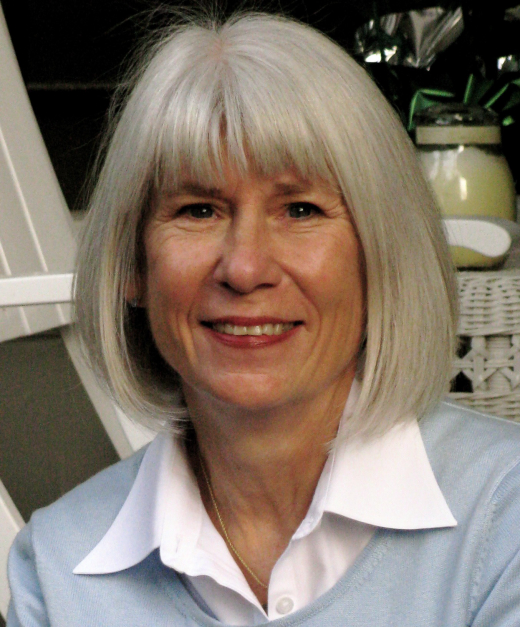
Susan Saarinen, daughter of architect Eero Saarinen and sculptor Lily Swann Saarinen, is an artist, designer, and artisan comfortable working in many different media. Susan grew up in the Cranbrook Educational Community, an intensely creative environment where her grandfather Eliel Saarinen was director, sculptor Carl Milles and ceramist Maija Grotell were teachers, and Susan’s godfather Charles Eames, furniture designer Florence Knoll, weaver Jack Lenor Larsen, and metal sculptor and furniture designer Harry Bertoia met and developed their crafts. Profoundly influenced by her early years, she holds degrees in Fine Arts (weaving and ceramics) and Landscape Architecture. Her firm, Saarinen Landscape Architecture, concentrates on environmentally appropriate projects. When she has time, she balances her design practice with fine arts. Saarinen has taught at Harvard, the University of Colorado at Denver, the Art Student’s League of Denver and a cultural exchange center in southwest France. She is presently writing her memoirs.


Credits

1 Designed by Albert Kahn, and Bertram Goodhue Associates, respectively.